The Archive
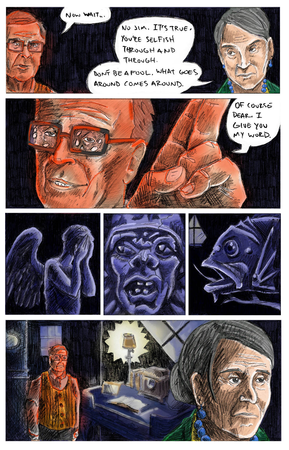
Beyond using the space itself to imbue the pages with a sense of growing dread, I also increasingly used cramped panels to unnerve the reader.
Pulling back to a long shot only when absolutely necessary.
Slowly suffocating the viewer.
*I* look at this page and want to claw my hair out, at how much the images are strangled and confined by those borders.
The noose tightens.
Pulling back to a long shot only when absolutely necessary.
Slowly suffocating the viewer.
*I* look at this page and want to claw my hair out, at how much the images are strangled and confined by those borders.
The noose tightens.


